Serebii Web App
Project Type: Case Study
The Prompt:
Revamp the look and feel of Serebii.net so that it matches the newly created Serebii Brand Identity case study, while also making a sleek new app design.
The Solution:
The current website suffers visually, having not changed its look for over 14 years. In part due to its outdated look, many new users are turned off of the website. It is a very difficult website to navigate having almost every data category on display. The information can be very overwhelming. Existing users love it’s nostalgic, old internet feel, however there are many new users that wish for a newer appearance.
The Pokémon brand as well as Nintendo, has placed almost all of it’s emphasis on mobility with all of its devices. Pokémon itself has always been exclusively on mobile and handheld game systems. New and existing users consistently complain that the web page is not mobile friendly, although the site has made attempts to make it so.
My strategy for the app:
Reimagine the website for mobile use, to fall better in line with the brand of Nintendo, Pokémon, and the current trend of internet use today
retain recognizability
maintain brand identity with past Serebii case study
Make the information easily digestible
Project Duration:
3 weeks
October 2020
Project Roles:
Research
Ideation
Design
Mockups
Software Used:
The website is massive, with tons of Information laid out. Turning this information into something easily digestible was a difficult task. There are a number of statistics associated with the pokemon game. For many players, theses statistics are just numbers.
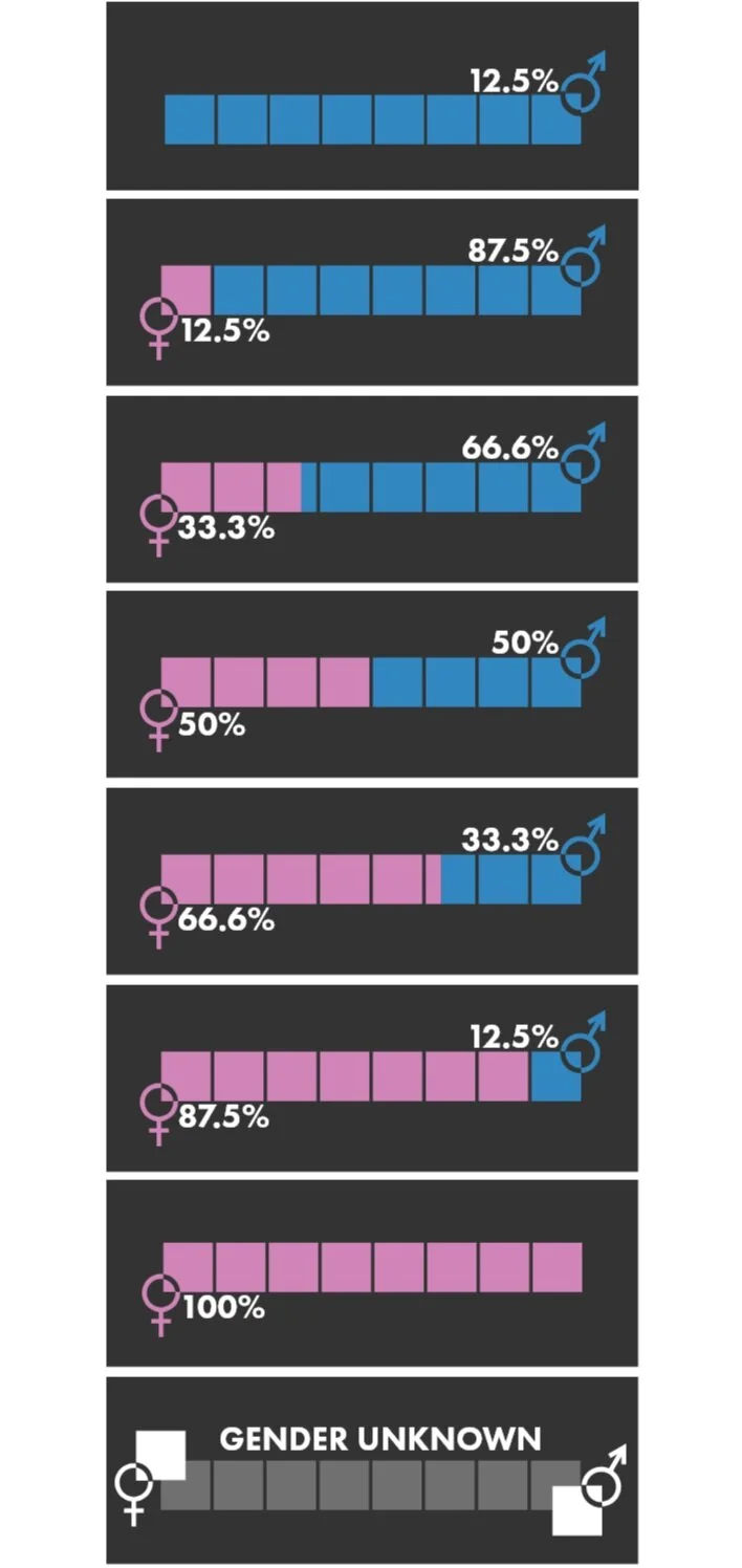
Doing research for this case study I came to find that there wasn’t any sorting method for a majority of this data. The numbers were there but no other way to understand them unless you were very involved with the metagame. The only thing I could find were the mathmatical formulas made to come up with the numbers in the first place. I made it my goal to have these stats represented into infographs so that even users unfamiliar with them may understand what they are.
Finding out how many different sets of data for each of these categories was a grueling task. Even harder when it came to some of the more specific stats.
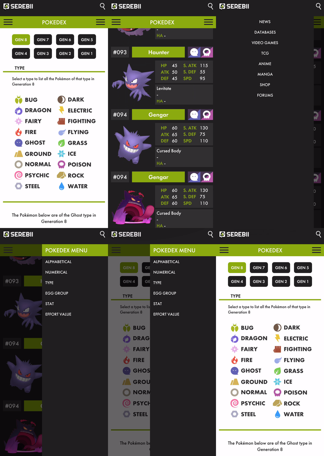
The most used aspect of Serebii is the Pokédex search. It has been refined and simplified from the current browser look.
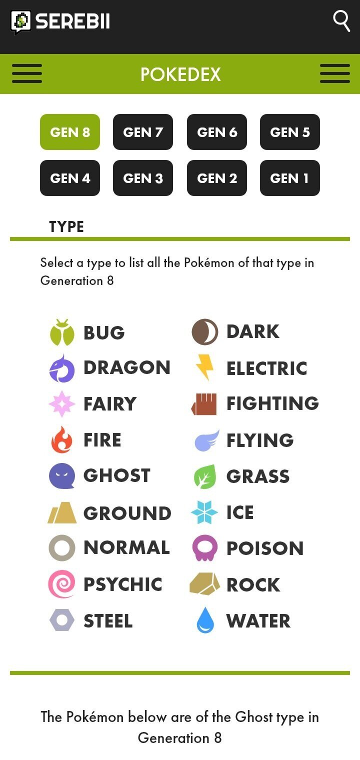

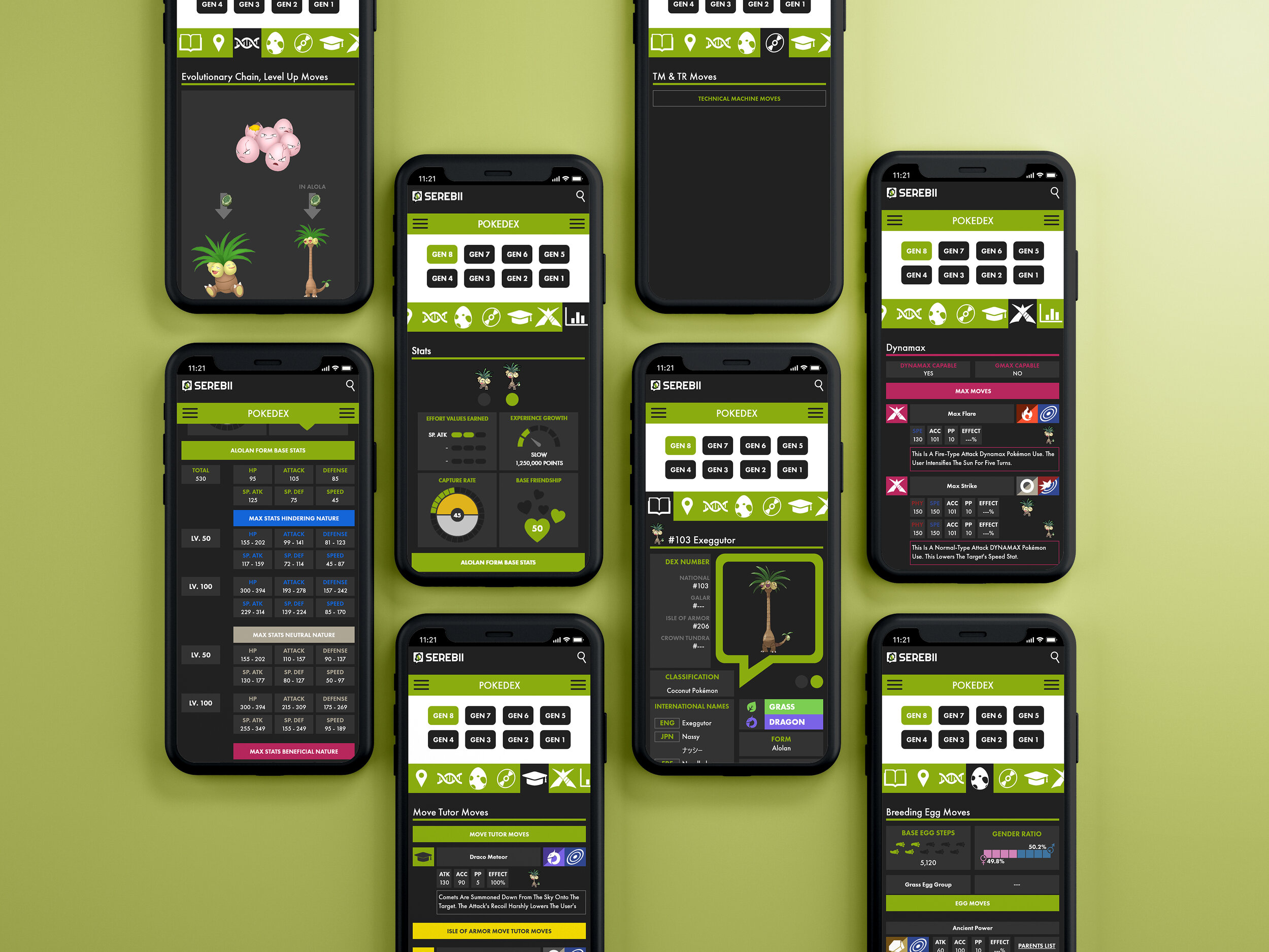
The Serebii Pokédex pages have been further condensed from their browser look for a sleeker gamer design.
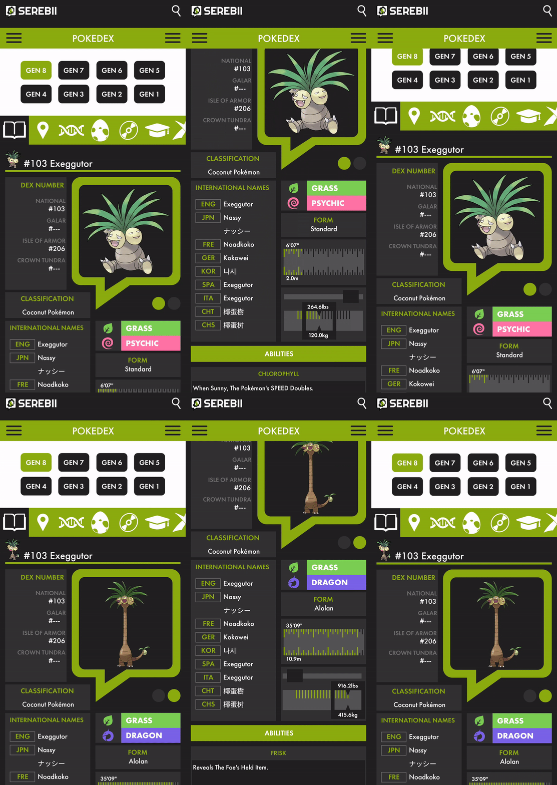


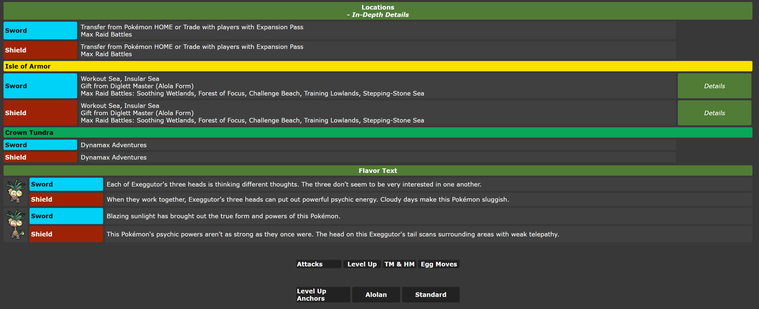
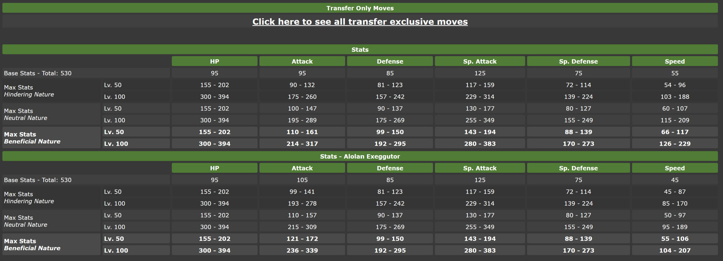
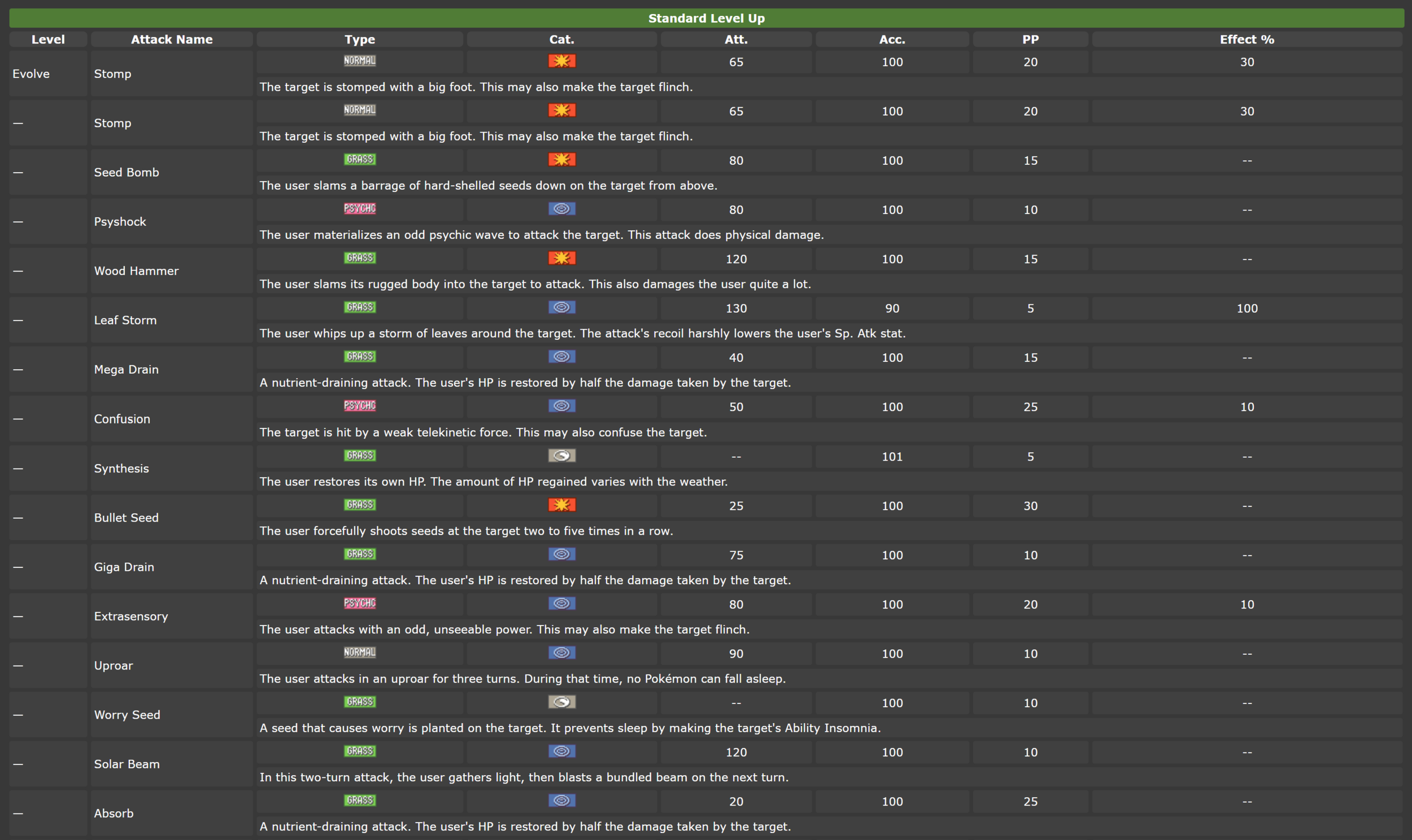
The excessively long Pokédex page has been split up into separate swipe sections with easily identifiable icons
The Home page of Serebii has all the news for the week simplified into carrousels so that each “day” can be swiped on and the total length of the page is shortened dramatically. Each photo then can be selected to see the full story.


